Sistem pengoperasian merupakan perisian sistem yang terpenting bagi setiap komputer. OS adalah satu atau lebih atur cara yang mengurus operasi CPU,mengawal input/output dan sumber storan dan aktiviti komputer serta pelbagai servis sokongan seperti pengurusan memori,ruang cakera dan lain-lain. DEFINISI OS Sistem pengoperasian atau operating system (OS) adalah set program-program yang dipasang dalam cakera keras. Tanpa OS, sesebuah komputer tidak dapat beroperasi dengan baik. OS sangat penting kepada komputer: TUGAS SISTEM PENGOPERASIAN I. Mengawal, menyelaras dan mengkoordinasi perkakasan. II. Menyediakan antara muka pengguna (User Interface). III. Membolehkan program aplikasi dipasang untuk kegunaan pengguna. TUJUAN SISTEM PENGOPERASIAN KOMPUTER I. Memaksimakan produktiviti sistem komputer dengan pengoperasian yang lebih efiksyen. II. Kompone...
DEFINISI SQL SQL merupakan bahasa pemprograman khusus yang digunakan untuk mengakses data dalam pangkalan data untuk menjalankan tugasan, kerja, fungsi dan pertanyaan pada data. SQL adalah salah satu aplikasi Database Management System (DBMS ) yang sering digunakan dalam operasi pangkalan data dan embedded pada kebanyakkan bahasa pemprograman yang menyokong pangkalan data. Perbezaan penggunaan SQL dapat dikenalpasti melalui sintak khusus yang digunakan untuk fungsian tertentu. Bahasa ini merupakan bahasa standard yang digunakan dalam pengurusan pangkalan data. Kini, hampir semua server pangkalan data yang ada menyokong bahasa ini untuk melakukan pengurusan data. Pada awalnya, SQL terdiri daripada bahasa definisi data (DDL) dan bahasa manipulasi data (DML). Bahasa SQL ini merangkummi insert, query, update dan delete, skema penciptaan dan modifikasi dan kawalan akses data. Pada tahun 1986, SQL menjadi standard dari American National St...
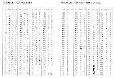
PENGENALAN ASCII ASCII ialah singkatan bagi American Standard Code for Information Interchange. ASCII adalah kod – kod yang digunakan untuk memudahkan interaksi antara user dan komputer. Dengan kata lain, ASCII digunakan untuk pertukaran maklumat dan komunikasi data dengan cara menukarkan angka kepada karakter aksara. ASCII sebenarnya lebih dikenali sebagai kod angka 7-bit yang mewakili sebuah karakter, ASCII digunakan kerana komputer hanya memahami angka sahaja. Asalnya kod ASCII mempunyai bilangan binary sebanyak 8-bit yang bermula dari 00000000 hingga 11111111. Jumlah kombinasi yang dihasilkan adalah sebanyak 255, bermula dari kod 0 hingga 255 dalam sistem Desimal. Kod ASCII 0 hingga 127 merupakan kod untuk manipulasi teks, manakala kod ASCII 128 hingga 255 untuk manipulasi grafik. Setiap symbol yang terdapat pada keyboard memiliki kod ASCII. Contohnya, huruf A memiliki kod ASCII 65; huruf a memiliki kod ASCII 97. Kod ASCII 65 jika diterjemah ke kod binary; (65 = 01000...

Ulasan